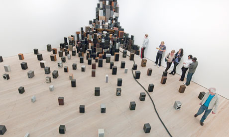
Some works manage a sort of daydreamy feel. Iain Hetherington paints baseball caps with a familiar NY logo, set among abstract splotches, as if the caps had been tossed into a hedge. It is all supposed to mean more than it achieves. A plaintive few piano notes drift through the galleries, interspersed with a bit of ambient twang and electronic moan. These emanate from John Wynne's collection of 300 audio speakers, all reclaimed from a recycling plant, that tower in the corner of a double-height gallery and stand about the floor. Somewhere in all this is an old upright piano playing a piano-roll taken from a 1909 operetta. But only some notes get played. It sounds like John Cage or Erik Satie, and never repeats. There's a clever electronic gubbins hidden away somewhere that determines the sounds we hear. Cage would have enjoyed this. The most disconcerting thing, however, is a long length of vacuum-cleaner hose that snakes from a doorway and between the speakers to the pianola. The hose quivers, writhes and slithers about, as a hidden Hoover powers the pianola. It's like sharing the room with an awakening python.
Glasgow artist Karla Black fills another gallery with just three works. Scrunched-up cellophane dangles from the ceiling; a swathe of clingfilm drifts across the floor; a huge, blue, homemade paper bag slumps under its own weight at a far end of the gallery. Odd smears and patches of colour adhere badly to the cellophane and clingfilm. She also adulterates the materials with lipstick, glitter hairspray and baby oil. It could be very slight, but somehow the effect stays with me and is rather magical, like the sounds in Wynne's work.
Elsewhere, a life-sized figure of the theosophist Madame Blavatsky appears to levitate between two chairs, in a work by Goshka Macuga, held aloft by the power of thought alone. Nearby, she has a very large desk littered with expensively rebound art books. Macuga's work is dense with references, and it all takes a lot of mental unpacking.
Macuga is serious, in a good way. So, too, are Pablo Bronstein's architectural drawings, which at first sight could hang in some dusty corner of a museum. In sometimes wormy old frames, and aged with tea stains, the drawings depict architectural eccentricities – Sir Christopher Wren's Temple Bar, the piazzas of Turin, the ruins of the Bastille – but something isn't quite right. Bits of horrible 1980s postmodern architecture intrude, and diminutive figures are dwarfed by their surroundings. There is something genuinely haunting about Bronstein's work. What his drawings are haunted by is history. The present and the past collide.
A similar collision of styles and periods is attempted by Ged Quinn, whose faux 18th-century landscapes are populated by inconsistencies: an Icarus falls from the sky who turns out to be Antonin Artaud. Quinn also furtively puts spraypainted swastikas and hammer-and-sickles on the flanks of a distant flock of sheep. Baaah. It's bad, and not in a good way. All that conspicuous skill, spent in the service of a sub-Jake and Dinos Chapman gag.
I much prefer Sigrid Holmwood's reworked 19th-century Nordic genre paintings, rendered in eye-biting fluorescent colour. Holmwood's palette is weird. She grinds her own paints, and puts hokey images of a lost rural and domestic life through the mill. There are pipe-puffing women, sturdy peasants, homely and bucolic scenes. It all flares, incomprehensibly.
Just as you think there's a theme to the show, it gets lost. Here come some tacky cartoonish figures pierced by fluorescent light tubes; there's a painting of Che Guevera, but it turns out to be Cher. It's a bit grim when the best thing one can think of some of the painters is that this one has been looking at Luc Tuymans, that one at the Leipzig school, another at too many comics. And then one comes across a lovely woven rug or bedspread, flopped and rumpled on the floor. Look closely and it's a tapestry, and some of the undulations and shadows are actually woven into the fabric's geometric design. Real shadows and woven, pixelated shadows. This is by Rupert Norfolk. He also provides us with a broken dry-stone wall. Look closely and one discovers that each stone is symmetrical – and that he has carved half of each stone to mirror its uncut side. The effect of Norfolk's work is to slow you down. But for what? I think he is trying to create a feeling of the uncanny. There's something not quite right about the world, or indeed this show.
There's a lot of heads, busts and portraits. One of Steve Claydon's works is a bust morphed from three political figures, but it is impossible to say who. Oswald Mosley? Stalin? Lloyd George? I mistook it for a head of writer Peter Ackroyd, and passed on. Daniel Silver sets his human and humanoid heads on biomorphic lumps of plaster, on wonky columns and fanciful plinths, which are often more interesting than the heads themselves. Jonathan Baldock's carnivalesque, highly detailed heads are sculpted from homemade play-dough, to which he adds synthetic hair and doll's eyes. As craft they're really good. As art they are negligible.
Saatchi's shows are not to be taken entirely seriously, and he has always shown as many duds as worthwhile discoveries – and it must be said that Saatchi himself has discovered very little. I wouldn't rely on his shows to tell me what was the best in new art, even if he has great spaces in which to show it. Nor can one identify any shared direction, a flavour, a style or a zeitgeist. The spirit of the age is elsewhere. Or maybe there just isn't one.
No comments:
Post a Comment